Thursday, 13 March 2014

Wednesday, 22 January 2014
Evaluation: In what ways does your media product use, develop or challange forms and conventions of real media products?
Research
Before I constructed my music video, I decided to do some vital research in order to help me follow essential codes and conventions. If I hadn't of analysed any existing videos this could have resulted in me not being able to produce appealing and successful media products.
During my research I found different types of music videos which helped me see the difference between each style of video that artists produce.
When researching what style of music videos KlangKarussell had created, I found it difficult to find many that they had already produced. When some of their existing videos, there wasn't a common style running through all of them. However, the ones I did find they were more of a concept video, rather than narrative. As they seemed to have a narrative in all their videos, I thought this is a convention that I must stick to. I did come across an animated video, but I thought this would of been too challenging for me to make a similar video in the amount of time I had to do make it in. When comparing the two main styles they have already done, I personally liked the concept videos because I liked their ideas that they had in their videos. The concept videos go better with the bands music as the music doesn't really tell a story either, they are always more of dance songs with little vocals. This was one reason why I decided to create a music video under this style.
Initial ideas
Before I had decided on my song and style of music video, I had a rough idea of what some theme or genre I wanted to do. This started out to be the complete opposite of what my video is today. After I had researched stop, go motion videos I decided I was creative enough to to be able to make a music video like this. I then decided a song which was called 'Counting Stars' by One Republic. I chose this song because it is up beat and happy, which was the type of song I needed to be able to make a stop, go motion video. However, after spending a week struggling to construct the video and realising how time consuming it all was I knew I needed to re-consider the type of video I wanted to make.
Therefore, after taking time to think and research, I realised that throughout the music industry recently there has been a lot more focus on festivals, parties and drinking. This is because with festivals and concerts becoming increasingly popular videos like this attract the audiences attention, as the majority of people like being able to relate to music videos or just escaping from their own personal lives by listening to a song or watching a video. Thus, I thought a concept video would be perfect for this genre. Another reason I preferred the concept videos was because I knew they were easily done and was more realistic for me to be able to make rather than stop go animation.
My initial idea was, like KlangKarussell's concept videos, I didn't want my talent to lip sync. This was because I think it looked better without her singing the lyrics than singing them. However, after constructing the video as receiving feedback I soon realised that I needed to incorporate lip syncing into the video to make it more interesting and to give variety.
Deconstructing existing music videos
After I decided what style of video I wanted to create, I thought it was best to look at existing videos from that genre and deconstruct their codes and conventions. I did my best to ensure that I stuck to typical conventions from existing dance videos that I deconstructed, so I was able to convince my audience that my music video (at first glance) was a stereotypical representation of a dance video, as there isn't usually a story line to them. I believe I conveyed this idea as best as I could.
Codes and conventions developed in my music video
Throughout my music video I kept referring back to two main existing music videos that I deconstructed, they were Adele's 'Someone like you' and Audio Bullies 'We don't care'. This was because I first looked at Audio Bullies music video and compared it to the original 'Sonnentanz' music video, by KlagKarussell. I quickly realised they are complete opposites in terms of the Mise en scene and also the music. However, when I was looking at them I watched the Audio Bullys video without music and had KlangKarussell playing in the background instead, and I thought it looked really effective. Therefore this is where I got the idea to make a rough looking music video to a juxtaposed song.
Throughout my video I constantly put dull effects on to the footage so it suggested the location to be needed sun light and that it was lifeless, whilst particular words in the song stood out e.g. "the sun don't shine". The dull effects are also seen throughout Audio Bullys video in the images that are shown below.
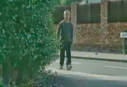


The effects I used were called the following: 'Black and White, Combat and Cold Steel. When I first used the effects on the footage it made the footage look very harsh and unrealistic to what the weather would look like on a dull day, or in the music videos I had researched. I mainly wanted the video to look more like Audio Bullys music video in comparison to Adele's. This is because the black and white effect that is used throughout Adele's video symbolises the sadness that she is feeling, whereas in Audio Bullys video the dullness that is used fits better with the mise en scene in my footage, the mood I was trying to convey and also the song. This is because the song I was using is a lot more up tempo compared to Adele's song.
When thinking about what types of camera shots I should use I look at both videos and noticed they both had a lot of tracking shots within them. From looking at this and also because I knew I wanted to film the talent walking through the town a lot, the best way to do this was to use tracking shots.
Audio Bullys video:

Adele's video:

My video:
 I didn't use many close ups, however I did use some camera shots with the talent walking past the camera. For this I mainly looked at Adele's video because her music video contains a considerable amount of these shots and close up's. Below are the examples of how I have used the conventions of Adele's video in my own.
Adele's video:
 My video:
 This is just one part of the close up as my talent walks past, like the screen shot of Adele's video. In my screen shot, you can see the skip. When filming I found the skip, and thought it would be the perfect opportunity to use the camera shot that was used in Adele's video whilst using the to symbolise the rough surroundings.
For the mise en scene in my music video I looked mainly at Audio Bullys music video because it contains a variety of mise en scene that contributes towards the rough feel of the town he is walking through. Therefore, I picked certain props and characteristics out of this video and incorporated it into my music video if I was lucky enough to find it in the town I was filming in.
Audio Bullys video:
 As you can see, to the right hand side of the image there are two phone box's that are in full view of the camera. I thought they denoted an English culture, I also think that with the posters over one of them that it indicates that its surroundings are messy. This type of appearance is usually found in rough places.
My video:
 Above is my perception of the phone box idea when I first came across the phone box I noticed that it wasn't as dirty as I would of liked, however there was a bin to the left of the phone box and white marks all over the floor. I thought about the positioning of the camera so I could include all three things in the frame to make it look dirtier.
I also noticed in Audio Bullys video as the talent was walking along pathways a lot, there were a couple of points that the camera captured some cars driving past. I liked this idea and for this reason I incorporated this into my video. This is shown below.
Audio Bullys video:
 My video:
 Within my shot I of a car driving past, unlike Audio Bullys camera shot I didn't place the camera behind bars. Looking back, I wish I did because it creates a sense of feeling confined and trapped. This would of worked perfectly in my music video. Like Audio Bullys camera shot I have contained more than just a car. However, instead of containing the talent in the frame I chose to have a bus stop in the frame so there is variety instead of having too much of my talent in all the shots. It didn't feel necessary.
The main media codes that I have yet to mention are the lighting, colours, location and costume.
When I was filming it was early afternoon on a normal, bright day. As I was filming outdoors for all of the music video the lighting was high key and ambient. I would of preferred it to be darker compared to what it ended up being like, this is because it would of gone better with the genre and location of the video. For this reason, I ended up changing the lighting and colours of the footage do that they were darker and more similar to the style of the video. I wanted the lighting to be low key so it was symbolic of the mood within the video i.e. lifeless, dull etc.
The locations that the footage was filmed in was specifically used for a number of reasons, these were; because I needed the landscaping to be urban and rough as the location was the main support of the genre; another reason was because the urban landscaping represented the surroundings that the talent was in and also helped to be symbolic of their mood. For example, the footage I captured of the ally way and the graffitied wall showed how rough the area was as graffiti is seen as a very unsociable act and is expected to be seen in rougher areas, rather than well kept, cleaner areas.
 As you can see in the image above the costume that I asked my talent to wear was a plain, dark brown jacket, plimsolls, jeans with her hair in a low ponytail. The reason I specifically asked her to wear this costume was because I wanted her to wear dark, basic clothes with her hair pulled back as if it was effortless. This was because I needed her clothes to be in tune with the video and the surroundings she was in, the costume also symbolises the lazy mood of the area and the talent because people that live in the this type of area in the video, usually don't make any effort with their appearance. Therefore I tried to show this through the costume. It wouldn't of looked right if I asked her to wear bright clothes with time consuming, complicated hair and jewelry. I specifically didn't want her to have jewelry on because it connotes wealth and luxury of the person. This is the opposite to the style within the video.
Conclusion
I believe that throughout the construction of my music video I have constantly kept looking back at conventions mainly within Audio Bullys and Adele's videos. This helped me to improve the professionalism of my music video and therefore I think I did well to develop the 'typical conventions' of existing videos in my own video because I thought about specific conventions and improved them by adding certain factors to them that would look better within my video.
Before I constructed my music video, I decided to do some vital research in order to help me follow essential codes and conventions. If I hadn't of analysed any existing videos this could have resulted in me not being able to produce appealing and successful media products.
During my research I found different types of music videos which helped me see the difference between each style of video that artists produce.
When researching what style of music videos KlangKarussell had created, I found it difficult to find many that they had already produced. When some of their existing videos, there wasn't a common style running through all of them. However, the ones I did find they were more of a concept video, rather than narrative. As they seemed to have a narrative in all their videos, I thought this is a convention that I must stick to. I did come across an animated video, but I thought this would of been too challenging for me to make a similar video in the amount of time I had to do make it in. When comparing the two main styles they have already done, I personally liked the concept videos because I liked their ideas that they had in their videos. The concept videos go better with the bands music as the music doesn't really tell a story either, they are always more of dance songs with little vocals. This was one reason why I decided to create a music video under this style.
Initial ideas
Before I had decided on my song and style of music video, I had a rough idea of what some theme or genre I wanted to do. This started out to be the complete opposite of what my video is today. After I had researched stop, go motion videos I decided I was creative enough to to be able to make a music video like this. I then decided a song which was called 'Counting Stars' by One Republic. I chose this song because it is up beat and happy, which was the type of song I needed to be able to make a stop, go motion video. However, after spending a week struggling to construct the video and realising how time consuming it all was I knew I needed to re-consider the type of video I wanted to make.
Therefore, after taking time to think and research, I realised that throughout the music industry recently there has been a lot more focus on festivals, parties and drinking. This is because with festivals and concerts becoming increasingly popular videos like this attract the audiences attention, as the majority of people like being able to relate to music videos or just escaping from their own personal lives by listening to a song or watching a video. Thus, I thought a concept video would be perfect for this genre. Another reason I preferred the concept videos was because I knew they were easily done and was more realistic for me to be able to make rather than stop go animation.
My initial idea was, like KlangKarussell's concept videos, I didn't want my talent to lip sync. This was because I think it looked better without her singing the lyrics than singing them. However, after constructing the video as receiving feedback I soon realised that I needed to incorporate lip syncing into the video to make it more interesting and to give variety.
Deconstructing existing music videos
After I decided what style of video I wanted to create, I thought it was best to look at existing videos from that genre and deconstruct their codes and conventions. I did my best to ensure that I stuck to typical conventions from existing dance videos that I deconstructed, so I was able to convince my audience that my music video (at first glance) was a stereotypical representation of a dance video, as there isn't usually a story line to them. I believe I conveyed this idea as best as I could.
Codes and conventions developed in my music video
Throughout my music video I kept referring back to two main existing music videos that I deconstructed, they were Adele's 'Someone like you' and Audio Bullies 'We don't care'. This was because I first looked at Audio Bullies music video and compared it to the original 'Sonnentanz' music video, by KlagKarussell. I quickly realised they are complete opposites in terms of the Mise en scene and also the music. However, when I was looking at them I watched the Audio Bullys video without music and had KlangKarussell playing in the background instead, and I thought it looked really effective. Therefore this is where I got the idea to make a rough looking music video to a juxtaposed song.
Adele
Audio Bullys
Throughout my video I constantly put dull effects on to the footage so it suggested the location to be needed sun light and that it was lifeless, whilst particular words in the song stood out e.g. "the sun don't shine". The dull effects are also seen throughout Audio Bullys video in the images that are shown below.
The effects I used were called the following: 'Black and White, Combat and Cold Steel. When I first used the effects on the footage it made the footage look very harsh and unrealistic to what the weather would look like on a dull day, or in the music videos I had researched. I mainly wanted the video to look more like Audio Bullys music video in comparison to Adele's. This is because the black and white effect that is used throughout Adele's video symbolises the sadness that she is feeling, whereas in Audio Bullys video the dullness that is used fits better with the mise en scene in my footage, the mood I was trying to convey and also the song. This is because the song I was using is a lot more up tempo compared to Adele's song.
When thinking about what types of camera shots I should use I look at both videos and noticed they both had a lot of tracking shots within them. From looking at this and also because I knew I wanted to film the talent walking through the town a lot, the best way to do this was to use tracking shots.
Audio Bullys video:
Adele's video:
My video:
Adele's video:
For the mise en scene in my music video I looked mainly at Audio Bullys music video because it contains a variety of mise en scene that contributes towards the rough feel of the town he is walking through. Therefore, I picked certain props and characteristics out of this video and incorporated it into my music video if I was lucky enough to find it in the town I was filming in.
Audio Bullys video:
My video:
I also noticed in Audio Bullys video as the talent was walking along pathways a lot, there were a couple of points that the camera captured some cars driving past. I liked this idea and for this reason I incorporated this into my video. This is shown below.
Audio Bullys video:
The main media codes that I have yet to mention are the lighting, colours, location and costume.
When I was filming it was early afternoon on a normal, bright day. As I was filming outdoors for all of the music video the lighting was high key and ambient. I would of preferred it to be darker compared to what it ended up being like, this is because it would of gone better with the genre and location of the video. For this reason, I ended up changing the lighting and colours of the footage do that they were darker and more similar to the style of the video. I wanted the lighting to be low key so it was symbolic of the mood within the video i.e. lifeless, dull etc.
The locations that the footage was filmed in was specifically used for a number of reasons, these were; because I needed the landscaping to be urban and rough as the location was the main support of the genre; another reason was because the urban landscaping represented the surroundings that the talent was in and also helped to be symbolic of their mood. For example, the footage I captured of the ally way and the graffitied wall showed how rough the area was as graffiti is seen as a very unsociable act and is expected to be seen in rougher areas, rather than well kept, cleaner areas.
Conclusion
I believe that throughout the construction of my music video I have constantly kept looking back at conventions mainly within Audio Bullys and Adele's videos. This helped me to improve the professionalism of my music video and therefore I think I did well to develop the 'typical conventions' of existing videos in my own video because I thought about specific conventions and improved them by adding certain factors to them that would look better within my video.
Tuesday, 21 January 2014
Wednesday, 15 January 2014
Evaluation: How effective is the combination of your main product and ancillary texts?
When creating all of the products for the ancillary tasks, I ensured that all of them fitted in with the urban landscape style. Therefore, I had to ensure that I kept continuity throught all my tasks. Below are the completed tasks for this project, such as the music video, magazine advertisement and finally digipak.
Video
Magazine advertisement

Digipak
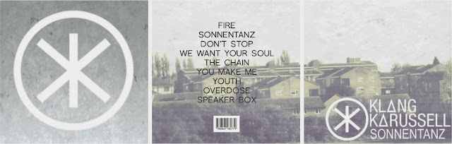
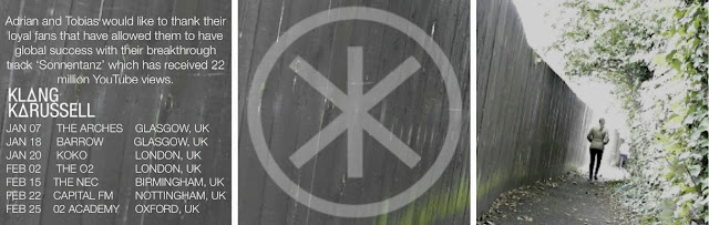
One of the main ways I kept continuity was the fonts that I used on both ancillary tasks. I ensured it was a bold font, as on existing album covers, theirs are usually big and bold to catch the audience's eye. This is an example of house style. The bands name is consistently the same font and colour throughout each task. The images below show this.
The inside digipak image is also seen within the music video, however in a video format. This consequently creates a visual link between these tasks. This is similar for the outside image of the digipak and the music video. For example, the view of run-down houses is seen in a video format within the music video. By creating these links within each task, it means that when the audience looks at a specific task, e.g. the digipak, they will think of the music video and where they have seen the image before. This could mean two things; if they have seen the music video before the digipak might remind them of the video and cause them to view it again. Alternatively, the audience could see the digipak and be intrigued to look at the video for the first time. This can also work the other way around, thus it is good to make a link between the tasks. The images below point out the previous commonalities I have just mentioned.
Throughout the construction of my video I made sure that if some footage was too bright compared to the rest of my work then I would put a darkening effect on it. The same effect was put on every clip if it was needed, it is called 'Colbat'. This is one way that I kept continuity through the making of the music video and also the ancillary tasks as I also put darkening effects on the images I used.
Video
Magazine advertisement
Digipak


One of the main ways I kept continuity was the fonts that I used on both ancillary tasks. I ensured it was a bold font, as on existing album covers, theirs are usually big and bold to catch the audience's eye. This is an example of house style. The bands name is consistently the same font and colour throughout each task. The images below show this.
The inside digipak image is also seen within the music video, however in a video format. This consequently creates a visual link between these tasks. This is similar for the outside image of the digipak and the music video. For example, the view of run-down houses is seen in a video format within the music video. By creating these links within each task, it means that when the audience looks at a specific task, e.g. the digipak, they will think of the music video and where they have seen the image before. This could mean two things; if they have seen the music video before the digipak might remind them of the video and cause them to view it again. Alternatively, the audience could see the digipak and be intrigued to look at the video for the first time. This can also work the other way around, thus it is good to make a link between the tasks. The images below point out the previous commonalities I have just mentioned.
Throughout the construction of my video I made sure that if some footage was too bright compared to the rest of my work then I would put a darkening effect on it. The same effect was put on every clip if it was needed, it is called 'Colbat'. This is one way that I kept continuity through the making of the music video and also the ancillary tasks as I also put darkening effects on the images I used.
Monday, 23 December 2013
Evaluation: How did you use media technologies in the construction and research, planning and evaluation stages?
Introduction
During the process of my planning, research, construction and my evaluations, I have used a variety of technologies to help me create my final pieces. Although at the time I didn't appreciate how much software and hardware I used, looking back I used a lot to create everything I wanted to achieve. Overall, I am happy with how all of my final pieces came together and in this evaluation, I will explain everything I used to help produce them.
Apple Mac
Due to the fact we have macs at school, I was able to spend time on my music video and ancillary tasks whenever possible. However, as I don't have an Apple Mac at home I found it difficult at times to spend my free time working on my coursework. This was because the school Mac's are used by multiple people, during lessons and not. Therefore, at times when I'd go to use the Mac with my coursework on it, it would be being used and this limited my time that I could spend on my work.
Furthermore, as this is my second year on the course, and consequently being able to use the Mac's, I am already reasonably experienced in using this technology. Thus, it meant that the construction on my A2 media products was noticeably easier.

Panasonic camera
As I am fortunate to have my own camcorder, I was able to use this whenever I needed to film. I knew that I would only need to use the Sony camera to record all of my footage, as it has all of the facilities I need. The camera enabled me to film whenever possible, inside and outside of school. Therefore, I was able to capture extra footage if I felt that I needed more even after editing the original footage I had at school. Along with this, close to the end of the deadline I wanted to change bits in the video. By having the camera to hand I could go home and capture last minute footage in my own time. Another advantage of having my own camera was that unlike borrowing a school camera, I didn't have to think about returning it in time to school. I also didn't have a certain time limit to be able to use the camera. This was very beneficial because if I had planned to record footage at the weekend and I was delayed because of bad weather then it didn't mess my plans up too much as I could just reschedule on my own terms.

Nikon camera
As my parents have had this camera for a couple of years now, I felt comfortable using the camera to capture pictures for the ancillary tasks. I was able to easily capture the camera shots I needed, whilst using the different lenses that come with the camera. Consequently, this was an advantage because it helped improve the quality of my work instead of using a basic digital camera.

Search engines
I have used a variety of search engines throughout this project, however there was one main search engine I used most of the time. This was Google. I used this more often than others because I know how to use it more than the other, such as 'Bing' or 'Yahoo'. Therefore, it was the quickest way to obtain information. I found the Internet extremely useful when it came to the researching stage as I was able to see what conventions I needed to stick to when creating my music video and ancillary tasks/ Due to the fact you can multitask freely, I was also able to search music videos for inspiration as well as using Blogger to write my thoughts down. As I am constantly updating my blog and using other websites, such as Pixlr, YouTube etc. this was my most highly demanded technology I ended up using. The only disadvantage of using Google was that there is so much information to choose from, I had to research carefully and be selective with the information I chose. This meant that it was quite a time consuming task to do at times.

Blogger
This again was one of my most used piece of technology throughout this piece of coursework, as I had to continuously write for my research, construction and evaluations of my final music video and ancillary tasks. As I am fortunate enough to access the internet, and therefore Blogger, at home and school I was able to update my posts whenever I needed to.

YouTube
YouTube was another main technology that came in handy during this coursework, as I looked at a variety of music videos to find the song that I wanted to use. As well as this, it gave me inspiration when planning what will go into the music video. Additionally, I uploaded my final product onto this website so people were able to view the finished video.

Final cut pro
This was a main technology that I used as it had the editing software I needed to help create a professional looking music video. As I have had some experience of using it at school in previous tasks, I was able to experiment with various transitions and editing techniques to make my video more appealing to my target audience. Therefore, this was mainly used for the construction of the music video, as well as audience feedback videos.

Pixlr
I used this image editing software to edit the images I took for my ancillary tasks (digipak and magazine advertisement). I used this software for manipulating images last year, so I felt very comfortable using it this year for the same purpose. During the construction of the digipak, I used this image editor program to help me create the dull effect and image overlays that KlanKarussell's existing album has. Along with this, I used this for the finishing touches of my magazine advertisement, where I used the different image effects and image darkening. The software helped me to improve both the digipak and magazine advert because it enabled me to create a style that was like KlangKarussell's and also the style I wanted throughout the project.

Prezi
Until last year when I used Prezi software for some of my music magazine evaluations, I hadn't used it before. Although it was a bit confusing to begin with, I now feel confident using it. Even though this software is some what time consuming, I decided to use other technologies for the researching and construction stages of my products. Therefore, I thought it would be a good idea to use it in one of my evaluations for my coursework. This is mainly down to the fact I can go into detail when concluding on my final products as well as it being more visually appealing to read than just blocks of text.

Mobile phone
Throughout the planning stage of my music video, I had to keep in touch with my talent so they knew what time they needed to be free for filming and if there was a problem on the day I could let them know quickly. Therefore, texting or ringing them from my phone was the best was to communicate with my talent, as well both have unlimited texts and phone calls which means we could communicate easily without it costing. This piece of technology helped a lot when organising dates to shoot the film.

Tripod
This piece of hardware helped a lot during the construction of the music video, as I was able to get smooth steady shots with the use of the tripod. At times I needed the hand held effect to make the video more moving, but at times (such as using a pan shot of a run down estate) I used this device to keep the camera in the same place all the way through. This was to get the best possible footage. Due to the fact it is portable and it collapses, I could take it wherever I went because it isn't heavy to carry.

Bicycle
This was a very handy piece of equipment that I used more that the tripod in the construction of the music video. This was because I used the bike to strap the camera onto the seat so I was able to use a tracking shot, this is seen at the beginning of the video when the talent is walking through the field. The bike was mostly easy to transport to different filming locations, apart from busy areas in the town as I had to be careful.

During the process of my planning, research, construction and my evaluations, I have used a variety of technologies to help me create my final pieces. Although at the time I didn't appreciate how much software and hardware I used, looking back I used a lot to create everything I wanted to achieve. Overall, I am happy with how all of my final pieces came together and in this evaluation, I will explain everything I used to help produce them.
Apple Mac
Due to the fact we have macs at school, I was able to spend time on my music video and ancillary tasks whenever possible. However, as I don't have an Apple Mac at home I found it difficult at times to spend my free time working on my coursework. This was because the school Mac's are used by multiple people, during lessons and not. Therefore, at times when I'd go to use the Mac with my coursework on it, it would be being used and this limited my time that I could spend on my work.
Furthermore, as this is my second year on the course, and consequently being able to use the Mac's, I am already reasonably experienced in using this technology. Thus, it meant that the construction on my A2 media products was noticeably easier.
Panasonic camera
As I am fortunate to have my own camcorder, I was able to use this whenever I needed to film. I knew that I would only need to use the Sony camera to record all of my footage, as it has all of the facilities I need. The camera enabled me to film whenever possible, inside and outside of school. Therefore, I was able to capture extra footage if I felt that I needed more even after editing the original footage I had at school. Along with this, close to the end of the deadline I wanted to change bits in the video. By having the camera to hand I could go home and capture last minute footage in my own time. Another advantage of having my own camera was that unlike borrowing a school camera, I didn't have to think about returning it in time to school. I also didn't have a certain time limit to be able to use the camera. This was very beneficial because if I had planned to record footage at the weekend and I was delayed because of bad weather then it didn't mess my plans up too much as I could just reschedule on my own terms.
Nikon camera
As my parents have had this camera for a couple of years now, I felt comfortable using the camera to capture pictures for the ancillary tasks. I was able to easily capture the camera shots I needed, whilst using the different lenses that come with the camera. Consequently, this was an advantage because it helped improve the quality of my work instead of using a basic digital camera.
Search engines
I have used a variety of search engines throughout this project, however there was one main search engine I used most of the time. This was Google. I used this more often than others because I know how to use it more than the other, such as 'Bing' or 'Yahoo'. Therefore, it was the quickest way to obtain information. I found the Internet extremely useful when it came to the researching stage as I was able to see what conventions I needed to stick to when creating my music video and ancillary tasks/ Due to the fact you can multitask freely, I was also able to search music videos for inspiration as well as using Blogger to write my thoughts down. As I am constantly updating my blog and using other websites, such as Pixlr, YouTube etc. this was my most highly demanded technology I ended up using. The only disadvantage of using Google was that there is so much information to choose from, I had to research carefully and be selective with the information I chose. This meant that it was quite a time consuming task to do at times.
Blogger
This again was one of my most used piece of technology throughout this piece of coursework, as I had to continuously write for my research, construction and evaluations of my final music video and ancillary tasks. As I am fortunate enough to access the internet, and therefore Blogger, at home and school I was able to update my posts whenever I needed to.
YouTube
YouTube was another main technology that came in handy during this coursework, as I looked at a variety of music videos to find the song that I wanted to use. As well as this, it gave me inspiration when planning what will go into the music video. Additionally, I uploaded my final product onto this website so people were able to view the finished video.
Final cut pro
This was a main technology that I used as it had the editing software I needed to help create a professional looking music video. As I have had some experience of using it at school in previous tasks, I was able to experiment with various transitions and editing techniques to make my video more appealing to my target audience. Therefore, this was mainly used for the construction of the music video, as well as audience feedback videos.
Pixlr
I used this image editing software to edit the images I took for my ancillary tasks (digipak and magazine advertisement). I used this software for manipulating images last year, so I felt very comfortable using it this year for the same purpose. During the construction of the digipak, I used this image editor program to help me create the dull effect and image overlays that KlanKarussell's existing album has. Along with this, I used this for the finishing touches of my magazine advertisement, where I used the different image effects and image darkening. The software helped me to improve both the digipak and magazine advert because it enabled me to create a style that was like KlangKarussell's and also the style I wanted throughout the project.
Prezi
Until last year when I used Prezi software for some of my music magazine evaluations, I hadn't used it before. Although it was a bit confusing to begin with, I now feel confident using it. Even though this software is some what time consuming, I decided to use other technologies for the researching and construction stages of my products. Therefore, I thought it would be a good idea to use it in one of my evaluations for my coursework. This is mainly down to the fact I can go into detail when concluding on my final products as well as it being more visually appealing to read than just blocks of text.
Mobile phone
Throughout the planning stage of my music video, I had to keep in touch with my talent so they knew what time they needed to be free for filming and if there was a problem on the day I could let them know quickly. Therefore, texting or ringing them from my phone was the best was to communicate with my talent, as well both have unlimited texts and phone calls which means we could communicate easily without it costing. This piece of technology helped a lot when organising dates to shoot the film.
Tripod
This piece of hardware helped a lot during the construction of the music video, as I was able to get smooth steady shots with the use of the tripod. At times I needed the hand held effect to make the video more moving, but at times (such as using a pan shot of a run down estate) I used this device to keep the camera in the same place all the way through. This was to get the best possible footage. Due to the fact it is portable and it collapses, I could take it wherever I went because it isn't heavy to carry.
Bicycle
This was a very handy piece of equipment that I used more that the tripod in the construction of the music video. This was because I used the bike to strap the camera onto the seat so I was able to use a tracking shot, this is seen at the beginning of the video when the talent is walking through the field. The bike was mostly easy to transport to different filming locations, apart from busy areas in the town as I had to be careful.
Friday, 20 December 2013
Audience feedback on final draft of the advert
I have taken the previous feedback from the first draft into account, and have made improvements based of their answers to the questions. I then issued my questionnaire again to the same people to see what their opinions were on the final draft. The information below are the questions and answers that I received.
What do you think about the overall advertisement?
Would this advert entice you to buy the bands album?
Specifically what do you like about the advert?
What do you think about the overall advertisement?
- It is different to most adverts that sell albums, however I like this
- The landscaping is very urban which ties in with your digipak
- I love the image compared to the previous image you used in your first draft
Would this advert entice you to buy the bands album?
- Definitely, it looks more like an advert for an album, especially for one of KlangKarussell's albums
- Yes, it looks really interesting and would make me want to check out their video and album
- Yes, the image and layout you have used looks exactly the type of band I would listen to so I would buy the album
Specifically what do you like about the advert?
- I love the layout that you have used for the bands name because it is the first thing that you see
- I like how you have cut half of the bin off instead of keeping it all in the frame
- I love the effects that you have put on the image because it gives the image a finishing touch, especially to the sky as that's where it is most visible
- I prefer how you have placed the bands name in the center of the advert, and also how you have changed the bands name from being in one straight line to staggered across the page
- I think you could still add small bits of writing to the advert, like the date the album is released
- You could of had your talent walking towards the camera to the right of image
- The bands logo could of been on the advert somewhere
Magazine advert - final draft
Below is the final draft of my magazine advert. This is with the edit of 'Dusty' that I used on Pixlr. The reason I like the edit over the top of the image is because it adds a bit more of a grey overlay and you can see the 'Dusty' effect mainly at the top of the image, in the sky, and also on the band name. The band name writing looks like it has a bit of a smoky effect on it, I think this makes the writing link in with the rest of the image and the overall style of the digipak and music video. This is because I have filmed and taken photos in rough areas which you would expect to see people smoking etc. Therefore the effect over the top of the band name links with the smoking of people that live in rough areas where the music video is based.
I have chosen to use this image over other image I was considering to use (such as the first image in my draft) because of the audience feedback I received from the previous draft. Another reason is because I liked the mise en scene within the image, for example the bin in the far left and the main focus being the phone box. The dirty floor with the broken glass makes the image feel even more rough than any other image that I was considering.
I like how the image is very minimal, but effective. I believe it is very effective because of the mise en scene, as previously stated, and the layout of the bands writing. I placed the bands writing in the middle of the image because I preferred it being the focus and the first thing that the audience sees. I know this by the audience feedback I received, as someone said the bands name was the first thing that they see when looking at the article. As I preferred the minimal feel of the image I didn't want to change the focus of the bands name to the name of the album. Along with this, I couldn't find a good place to put the name of the album on this image without subtracting focus from the bands name and actual image.
I have previously shown in another post the editing process of the image I have chosen for the article. However, I shall show the process again below.
Step 1 - Original image

Step 2 - Colour correction

Step 3 - Adding of writing

Step 4 - Image overlay
Thursday, 19 December 2013
Feedback from first draft of the magazine advertisement
For this audience feedback I asked a group of people that I think would be the target audience for the band's music. This was because I wanted to receive realistic audience feedback, so I could improve the magazine advertisement to their ideas.
What do you think about the overall advertisement?
Would this advert entice you to buy the bands album?
Specifically what do you like about the advert?
What do you suggest could be improved?
What do you think about the overall advertisement?
- It is very simple, yet eye catching
- The area looks very rough with the rails to the right hand side of the image used
- There is minimal lighting which creates almost an unhappy atmosphere
- The image is very interesting because it makes you want to know more about it and what it is advertising
Would this advert entice you to buy the bands album?
- Yes, because it looks interesting
- Not really because it doesn't have very much about it
- No, I don't think it looks much like an advert to sell an album
Specifically what do you like about the advert?
- I like the minimal look that you have gone for
- The style of writing that you have used because it makes it eye catching
- I like the effects you have put on the image because it makes the overall look seems very urban and rough
What do you suggest could be improved?
- I would arrange the layout differently, for example changing where the bands name is on the page
- I would change the image because there isn't much to look at with the current image
- I would add more text on the current page so the audience are able to see what is being advertised
- I would only change the image that you have used for similar reasons to the previous comment
Magazine advert - first draft

Step 1 - Original image

Step 2 - Colour correction

Step 3 - Image overlay

Step 4 - Writing added
Some of the photo's that I have displayed in that same post I have also considered using in the magazine article. These images are the images I considered are displayed below.
1.

2.

3.
4.
Friday, 6 December 2013
Feedback on my final digipak draft
I have taken the previous feedback from the first draft into account, and have made improvements based of their answers to the questions. I then issued my questionnaire again to the same people to see what their opinions were on the final draft. The information below are the questions and answers that I received.
Whats your overall impression on the digipak?
What would you change?
What do you like the best?
What do you think about the images that are used?
As you can see from the feedback the things that they said they would change are very minor and don't impact on the overall look of the digipak. I am pleased that the audience like the logo on the outside page, and the effects that I put onto the images. I am also happy that one person said it looked very urban and 'grungey' as this was the look I have been aiming for throughout the project. Therefore I am happy with the changes I have made and the feedback I have received, and for these reasons this will be my final draft of the digipak.
Whats your overall impression on the digipak?
- It reflects the style of the music video, clear logo
- Very urban and 'grungey'
- Creative and well thought out
- Stands out compared to most digipaks
What would you change?
- One continuous image across the three pages.
- Slightly brighten the outside image
- Move the barcode to the left instead of the middle
- Nothing, I like it all as you have taken on board the previous comments
What do you like the best?
- Likes the inside image and outside page with the logo.
- The font
- The position of the font and logo on the outside, front page as it challenges the conventions
- The effects on both images, as it makes them the main focus of the digipak
What do you think about the images that are used?
- Likes the inside image of the girl waking, think it flows. It is good because the eye naturally flows left to right, and image helps this as it is a long running image with the most important factor on the right hand side.
- Fit well with each other and the music video
- Mise en scene is thought out well and fits well for the style you are trying to achieve
- Much better than the previous images used for first draft
As you can see from the feedback the things that they said they would change are very minor and don't impact on the overall look of the digipak. I am pleased that the audience like the logo on the outside page, and the effects that I put onto the images. I am also happy that one person said it looked very urban and 'grungey' as this was the look I have been aiming for throughout the project. Therefore I am happy with the changes I have made and the feedback I have received, and for these reasons this will be my final draft of the digipak.
Tuesday, 3 December 2013
Final draft of digipak
After making some adjustments to my previous draft from the comments from the audience feedback, I am happy with this final draft of my digipak and the feedback it received.
Outside
Inside
The far left inside page is all their upcoming tour dates with a 'Thank you' message at the top for their fans. The middle, inside page is where the CD will go. I have made the logo faint because I wanted it to be slightly visible behind the CD. The far right page is the end of the photo, I didn't want to put anything on this page because I liked the image how it was. Also I tried putting the band name in the bottom left hand corner but it made the page look too much like a front cover, and this wasn't what I wanted. Therefore I left it blank.
Monday, 2 December 2013
Final draft of music video
Below is my final draft of my urban, concept music video. I have made changes to the first draft of the video by acting on the feedback I received from my target audience. You can find the audience feedback in the post named 'Audience feedback on the final draft of the music video'.
Saturday, 30 November 2013
Audience feedback on the first draft of the music video
Below is the audience feedback on the music video. I think it is very important to find out their opinions on the video, in detail because it will help me to make any changes that are possible in later dates. You will see that the feedback that I received is mostly positive, and the negative comments that I did receive will only help me more. I am very pleased with the feedback I received, especially on the third question, because they compared it to the original Sonnetanz video and picked up on the style of video I was trying to achieve i.e. an opposite style to the original.
What would you change?
- I think you could have filmed lip syncing rather than a lot of footage of the landscape, it would make it seem more interesting and give it variety
- I think you could have introduced different transitions into your cuts to break sections up
- You could have included some close ups of your talent
- There could have been some lip syncing in the video, not all the way through though because I think it would of ruined the style you were going for
- The second talent that you introduce towards the end, you could of took the opportunity to be more mysterious or on the other hand you could of had more footage of her and been more informative
What do you like most about the music video?
- I like how you have left the ending open and haven't suggested too much with introducing another talent
- I like the tracking shots you have used throughout, especially your tracking shot in the field because the background goes really well with your style of video
- I love the shot of the talent in the phone box and then how you have slowed it down as she is walking out of the frame
- I like how you haven't made your talent lip sync because I wouldn't expect it in a KlangKarussell music video
- My favourite part is when you have made quick cuts towards the end of the video, as it suggests the talent is looking back on where they have been. It also reminds the audience parts of the video earlier on
- I love the three reversed sections towards the middle, but I think they could have been more in time with the beat. (The reversed sections were meant to be in time with the beat of the song but for some reason when uploading the video to YouTube it became out of sync. I have now fixed this within the final draft).
Do you think that the music video fits well with the music/lyrics?
- Yes, I like how you have done the opposite as to what you would expect from a song like this, as the song seems very happy and the video is about how the talent isn't happy
- I think you have been very creative in the construction of the video because I noticed that when you have made a cut in the footage it is in time with the beat of the music, it lets you get really into the music whilst watching the video
- Comparing it to the original Sonnetanz video it surprised me in the direction that you went. However, I think that this is an advantage because you have still followed in the footsteps that KlangKarussell would take
- I do think it fits in well at the moment but I think for it to improve and to fit in even more, you could of contained lip syncing in the video
First draft on my music video
Below is my first draft of the music video I have been constructing. This has taken me some time to devise and construct, however with all the helpful research of existing texts and urban landscaping I feel I have done well to create this first draft.
I have received audience feedback on this first draft with the blog post 'Feedback on the first draft of the video'. From this feedback I will take the comments that were made on board and also spot trends that can point out the strengths and weaknesses of the video. The weaknesses that are mentioned I will then change and turn them into a strength whilst keeping the target audience in mind.
Friday, 29 November 2013
Equipment I used for filming
I used three different pieces of equipment to help film my music video. They are the following:


- Panasonic camera - This was the camera that I recorded the whole of my footage on for the music video. I wanted to keep all my footage on the same camera so that I didn't lose any.
- Tripod - I used this when I needed still shots when filming, it wasn't used as much as I expected to use it. It was quite easy to carry around as it is light and easily made smaller.


- Bike - I used the bike so I could film tracking shots. At first I contemplated what to use and whether I should just have the camera handheld for the tracking shots, however I wanted it to be smooth and to get a clear image of my talent. Therefore, after talking to my teacher and considering my options I decided to use a bicycle. I put the camera on the seat of the bike by sellotaping it to the seat and making sure it was secure and didn't move during the filming. It wash't as smooth as I thought it would be, only because of the uneven floors that I was filming on. For example, the tracking shot where my talent was walking through the park, it was quite bumpy so I had to cut out parts when the camera wasn't smooth and consistent. The bike was very easy to move between areas of filming, however it got in the way when we were filming in the alley way as it was a narrow place to film and there were passing people.

Finished filming, now editing
Now that I have finished filming I plan to edit the footage I have gathered and then edit it, to make it into a music video.
When editing the footage I want to use some colour correction so that it is dull and keeps with the style that I want to achieve. The first thing I will need to do is watch the footage back and decide which parts I want to incorporate into the video, and parts that I didn't. I have learnt from previous projects that when it comes to editing I am a perfectionist, therefore it could take some time before I am completely happy with the finished video. However, I will use it to my advantage as it will help me to create an effective music video. I have an idea of what scenes will go where within the video, for this reason it could save me some time instead of trying to decide which piece of footage I should use in a specific place.
Whilst completing this task I will need to consider the digipak that I am in the process of making and the look it conveys, as my work needs to be consistent with the style. Once I have completed the editing and digipak I will create the advertisement for the digipak, therefore these are the next steps I will take.
Monday, 25 November 2013
Audience feedback on first draft of the digipak


Below is my audience feedback from my first draft of the digipak. For this feedback I asked four people to look at the digipak and then share their opinions with me.
Whats your overall impression on the digipak?
- Dark and 'dingey'
- Quite urban and reinforces the band by the constant use of the bands logo and band name
- Nice layout
What would you change?
- The colour of the writing stating the song names as it is hard to read on the type of image you have used
- The image on the far right on the inside because there is too much going on in the background to be able to read the writing
- The layout of the front cover because the band names writing looks like it should be against the left hand side
- Consistently use bright writing in every part of the digipak
- On the front page, the bands name and album title aren't in line
What do you like the best?
- The font
- The logo page on the outside of the digipak
- The content on the far right, inside page. For example, the tour dates and venues
- They make it look like there is too much going on because there are so many different images
- The use of the images outside are very good and link well with each other
- The inside images are too different, as in the image of the talent and the phone box image
- The images that have been used are too dark
Subscribe to:
Posts (Atom)